
In the realm of art and design, color holds an unrivaled power to captivate and communicate. By strategically combining colors, we can evoke specific emotions and create harmonious visual experiences. One such captivating color scheme is the “Triadic Color Scheme.” In this guide, we will explore the enchanting world of triadic colors, uncover their hidden secrets, and empower you to harness their potential in your own creative endeavors.
The Allure of Triadic Colors
Triadic colors, as the name suggests, revolve around the concept of three. It involves selecting three colors that are evenly spaced from each other on the color wheel. By embracing the perfect equilibrium between hues, triadic color schemes infuse a vibrant energy into any composition. These color combinations provide a harmonious blend of contrast and balance, making them visually striking and appealing to the human eye.
Unveiling the Triadic Color Scheme
Exploring the Color Wheel
To comprehend the magic of triadic color schemes, we must first acquaint ourselves with the color wheel. The color wheel is a visual representation of the entire spectrum of colors, arranged in a circular format. It is divided into primary, secondary, and tertiary colors, each with its own distinct position and significance.
Selecting the Perfect Triad
When creating a triadic color scheme, we select three colors that form an equidistant triangle on the color wheel. This means that each color is spaced approximately 120 degrees apart from one another. The resulting composition exhibits a dynamic interplay of warm and cool colors, delivering an arresting visual impact.
Embracing Vibrant Harmony
Triadic color schemes offer a delightful harmony of hues that can breathe life into any design project. The juxtaposition of contrasting colors creates a sense of visual excitement and intrigue. When applied with finesse, this scheme ensures a dynamic and captivating experience for the viewer, leaving a lasting impression.
Three Actionable Tips for Triadic Mastery
Now that we have explored the fundamentals of triadic colors, let’s dive deeper into three actionable tips that will elevate your mastery of this mesmerizing color scheme.
Tip 1: Balance is Key
When working with triadic colors, achieving a harmonious balance is crucial. The three selected colors should share equal visual weight to maintain equilibrium. Avoid overpowering any one color, as it may disrupt the intended harmony. Strive for a proportional distribution of hues to create a visually pleasing and well-balanced composition.
Tip 2: Harnessing Contrast
The essence of triadic colors lies in their inherent contrast. To make the most of this scheme, leverage the contrasting properties of the chosen hues. Emphasize the juxtaposition between warm and cool colors, or experiment with lightness and darkness. By accentuating the contrasts, you will amplify the visual impact of your design, leading to a more engaging and captivating experience.
Tip 3: Tonal Variations
While triadic colors offer a harmonious blend, it’s essential to introduce tonal variations within the chosen palette. By adjusting the saturation and brightness levels, you can create depth and dimension within your composition. This variation adds visual interest and prevents the color scheme from appearing flat or monotonous.
Frequently Asked Questions (FAQs)
Q1: How can I choose the right triadic colors for my project?
Selecting the perfect triadic colors requires careful consideration. Begin by identifying the primary color that best aligns with your project’s theme or mood. From there, explore the color wheel to find two other colors that form an equidistant triangle with your initial choice. Experiment, test, and trust your artistic instincts to discover a harmonious triadic color scheme that resonates with your vision.
Q2: Can triadic colors be used in various design disciplines?
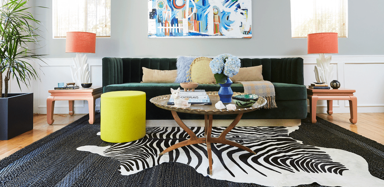
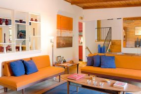
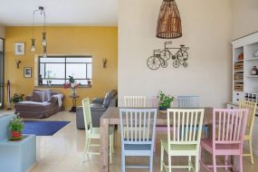
Absolutely! Triadic color schemes are versatile and can be applied to a wide range of design disciplines, including graphic design, interior design, fashion, and more. Their inherent visual appeal and balanced contrast make them suitable for creating eye-catching logos, impactful illustrations, compelling layouts, and captivating living spaces.
Q3: Are there any limitations to using triadic color schemes?
While triadic colors offer a visually pleasing experience, it’s essential to use them thoughtfully. Avoid overcrowding your design with too many competing hues, as it may lead to a chaotic or overwhelming composition. Additionally, consider the emotional impact of each color and ensure they align with the intended message or atmosphere of your project.
Q4: How can I incorporate triadic colors into my website design?
When incorporating triadic colors into web design, keep in mind the importance of accessibility and readability. Ensure that text remains legible against the chosen color scheme. Use triadic colors strategically to highlight important elements, such as buttons, links, or headings. By maintaining a balance between aesthetics and usability, you can create visually stunning websites that engage and delight your visitors.
Q5: Can I modify the saturation and brightness of triadic colors?
Yes, modifying the saturation and brightness levels of triadic colors is an effective way to add depth and variety to your composition. Experiment with different tonal variations to achieve the desired visual impact. However, be mindful of maintaining the overall balance and harmony of the triadic color scheme.
Conclusion
Triadic color schemes are a treasure trove of creative possibilities, offering a harmonious blend of contrasting hues. By understanding the principles behind triadic colors and following the actionable tips provided in this guide, you can unlock the full potential of this captivating color scheme. Embrace the vibrancy, balance, and visual excitement that triadic colors bring, and let your imagination soar to new artistic heights. Happy designing!
Advertisement


Homestylez.shop is an online platform dedicated to simplifying the home styling process. With a wide range of home decor products and accessories available, the platform offers users a seamless experience in finding and purchasing items to enhance their living spaces. The website provides a user-friendly interface that allows readers to explore various categories such as interior design tips, home improvement ideas, and product recommendations based on their preferred style and budget. Users can access comprehensive information about each topic, including detailed articles, inspiring images, and expert advice, to make informed decisions about their home styling projects. Homestylez.shop also offers a wide selection of products from trusted brands, ensuring that readers can find high-quality and stylish options for their home. The platform's commitment to providing valuable content and a user-friendly experience guarantees an enjoyable and informative visit. With its dedication to helping readers create comfortable and visually appealing living spaces, Homestylez.shop aims to be a reliable source for individuals seeking inspiration and guidance in the world of home styling.
© 2022. All rights reserved by homestylez.shop.
